For a colonial home, classic and timeless colors are key to complementing the traditional architectural style. Here are five top color recommendations from our expert designers at Dzinly, along with coordinating colors and accents to enhance your home's exterior:
Classic White is a staple for colonial homes, it provides a clean, crisp look and highlights architectural details like shutters and trim.
Notes from the Designers:
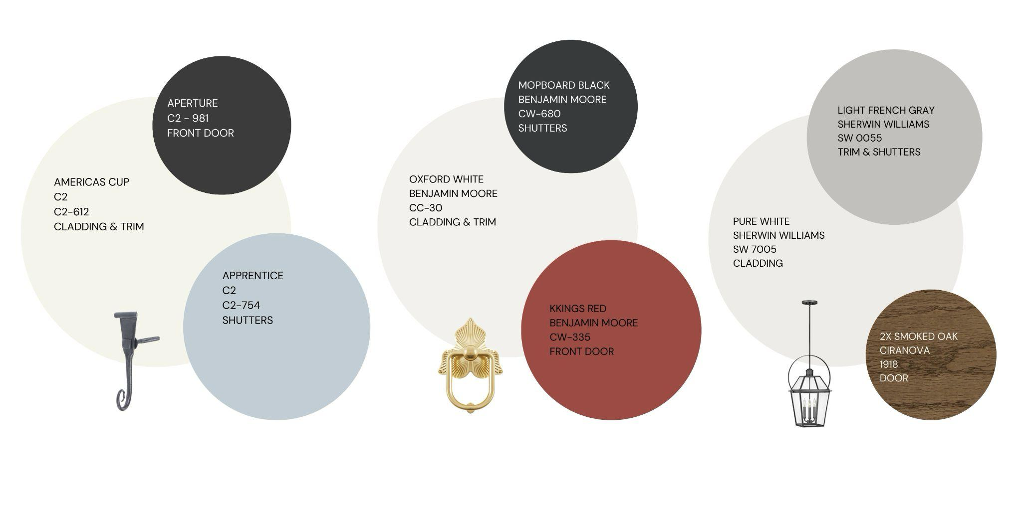
| Palette#1: This creamy white from the up-and-coming paint brand C2 is a game-changer. Exploring their colors opens the door to discovering perfect shades and tints that can beautifully transform your home's exterior. C2’s ‘America’s Cup’, described as classic and timeless, this color perfectly embodies the spirit of a colonial home. Pair it with the bold and sophisticated C2 ‘Aperture.’ This deep black adds beautiful depth to the front door, while the soft, light blue of C2 ‘Apprentice’ creates a complementary contrast on the shutters. Add the finishing touches with shutter dogs, hinges, and window boxes to complete the look. These colors not only elevate an all-white home but also look stunning against a brick facade or with a German Schmear finish, offering a fresh yet classic take on colonial style. | Palette #2: Trending colors may favor warm whites, but a classic colonial home shines with a timeless true white. ‘Oxford White’ is not too creamy, not too stark—just the right shade to give your colonial the perfect bright finish. Pair it with a traditional red on the door like ‘Kings Red’ by Benjamin Moore and Benjamin ‘Moore's Mopboard Black’, a shade found by researchers on mopboards in the Historic Area of Colonial Williamsburg. Adding a touch of gold is always a win; a charming door knocker is a perfect accent for colonial homes. Complement it with other gold accessories like lighting, a doorknob, address numbers, and a mailbox for an elegant look.
| Palette #3: Sherwin Williams' ‘Pure White’ is an outstanding choice for your home's exterior siding and trim, delivering a crisp and clean backdrop that brightens the entire facade. For a touch of contrast, Sherwin Williams' ‘Light French Gray’ for the shutters. This versatile gray has a balanced tone that avoids being too cool, providing a perfect complement to the white siding. To complete the look, ‘Ciranova Smoked Oak x2’ on the front door adds a warm, inviting touch, enhancing the overall entrance and creating a welcoming first impression. |
Navy Blue adds a rich, sophisticated touch while maintaining a traditional feel. It pairs well with white trim and brass or copper accents.
Notes from the Designers:
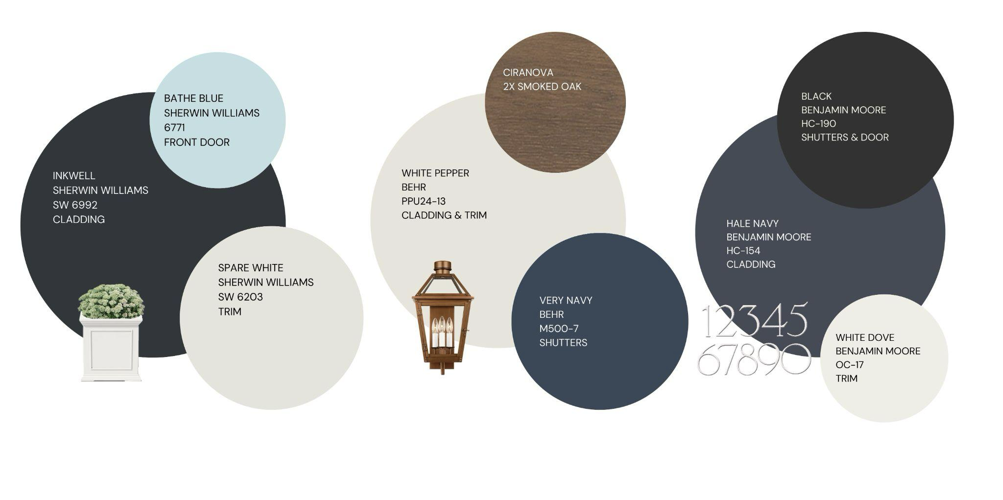
| Palette #1: Sherwin Williams ‘Inkwell’ is a deep blue with an edge, perfect for those who want to break away from the ordinary. Pair it with sleek monochromatic trim or crisp white for a bold, modern contrast that really pops. Take it up a notch by adding a light blue accent—this fresh and unexpected combo brings a funky, contemporary vibe to a classic colonial exterior, giving your home a standout look. | Palette #2: Behr’s ‘Very Navy’ is a timeless deep blue that adds a touch of elegance to a colonial exterior. Pair it with Behr’s ‘White Pepper’ for the trim—a warm, inviting white that provides the perfect canvas for copper accents, crisp white planters, and a wood front door. This combination creates a refined yet striking look, giving your home a classic charm with a fresh, modern edge.
| Palette #3: Benjamin Moore’s ‘Hale Navy’ is a versatile navy blue that pairs beautifully with a variety of accent colors. Complementing the dramatic navy siding is Benjamin Moore's ‘White Dove’ for the trim, a warm, soft white that provides a crisp contrast, highlighting the architectural details without appearing too stark. The shutters and front door feature a bold black finish, adding a touch of elegance and sophistication, creating a striking focal point that draws the eye.
|
Gray offers a modern twist on classic colonial aesthetics. It provides a neutral backdrop that complements various trim colors.
Notes from the designers:
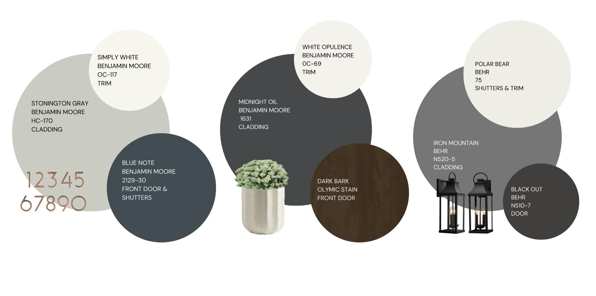
| Palette #1: Benjamin Moore’s ‘Stonington Gray’ offers a light, airy appearance that maintains brightness without the starkness of white. This subtle gray serves as the perfect backdrop for a striking trim and front door in ‘Blue Note’—a deep, distinctive blue with hints of green and yellow undertones that add depth and intrigue. For a polished finish, crisp white on the trim enhances the overall look, creating a clean contrast. The addition of copper accents ties everything together, adding warmth and a touch of elegance to this sophisticated exterior palette. | Palette #2: Benjamin Moore’s ‘Midnight Oil’ is a rich, deep gray that exudes sophistication and depth. This striking hue pairs beautifully with a dark stain like Olympic Stains ‘Dark Bark’, adding a touch of warmth and natural elegance. The contrast is heightened with ‘White Opulence’ trim, creating a crisp, clean frame that highlights the richness of the gray. Add gold and white accents throughout for a touch of luxury and brightness, pulling the entire look together into a refined and harmonious exterior design. | Palette #3: Choosing Behr's ‘Iron Mountain’ for the siding is a fantastic way to achieve a sophisticated and modern exterior. This deep, moody gray adds depth and dimension, creating a versatile backdrop that elevates the home's overall look. To complement Iron Mountain, Behr ‘Polar Bear’ was selected for the shutters and trim—a crisp, clean white that offers a stunning contrast, accentuating the architectural features while adding brightness and freshness. The front door, painted in Behr ‘Blackout’, adds a bold and striking touch, serving as an eye-catching focal point that infuses the design with an added layer of sophistication and drama.
|
Neutrals: A muted green that adds a subtle hint of color while still aligning with traditional colonial palettes. It works well with both light and dark trim colors.
Notes from the designers:
| Palette #1: Benjamin Moore’s ‘Pale Oak’ is the ideal light neutral for your home’s cladding, whether it’s brick or siding. This soft shade creates an elegant backdrop, especially when used in an all-monochromatic design. If you’re looking for contrast while keeping a neutral palette, consider pairing ‘Pale Oak’ with Benjamin Moore’s ‘Chelsea Gray’ or ‘Kendall Charcoal’ for doors and shutters—these deeper, yet still subtle tones enhance the overall look without overpowering it. Add a fun door knocker for a touch of personality and style into the mix. | Palette #2: Sherwin Williams ‘Perfect Greige’ truly lives up to its name—this soft, warm neutral provides the perfect backdrop for a bright coral door, creating a vibrant yet balanced look. The coral door explores shades and tints of red, adding a playful pop of color that contrasts beautifully with the greige. Pairing this combination with a creamy white trim enhances the overall design, giving it a classic touch with a fun twist. Warm accents, like lighting fixtures, address numbers, and planters, tie the look together, adding cozy charm to the exterior.
| Palette #3: Opting for Romabio ‘Cristallo White Limewash’ on a home's brick exterior is a stunning choice. This lime wash offers a soft, natural finish that preserves the texture and character of the brick while giving it a fresh, updated look. For the trim, Sherwin Williams ‘Cotton’ is a warm, soft white that beautifully complements the ‘Cristallo White Limewash’, creating a harmonious and cohesive palette. To add depth and a modern twist, Sherwin Williams ‘Anonymous’ was chosen for the shutters and front door. This rich, sophisticated neutral introduces a striking contrast, enhancing the overall design with contemporary warmth and style.
|
Brick and Stone emulates the look of traditional brick facades and adds warmth to the home. It pairs nicely with white or cream-colored trim.
Notes from the designers:
| Palette #1: For colonial homes, neutral toned stone is a classic look. Keep the exterior bright by opting for light-colored siding paired with a subtly contrasting trim and front door. Draw inspiration from the colors in the stone and highlight the warm orange hues in copper accents and gutters. For example, if your stone features bluestone, consider a blue door to complement the natural tones and add a coordinated pop of color. | Palette #2: For a striking yet classic look, combine red brick with ‘Iron Ore’ gray for a dramatic contrast. Opt for a bold black front door and shutters to complement the deep tones, creating a sleek and sophisticated focal point. Pair this with Sherwin Williams ‘Toque White’ siding, which offers a crisp, clean backdrop that balances the rich hues of the brick and iron. Enhance the overall design with Anthropologie address numbers in black and gold, adding a modern and stylish touch that ties everything together seamlessly.
| Palette #3: German Schmear is an excellent choice for a home's brick exterior because it imparts a timeless appearance that adds character and charm. This technique creates an inviting look that blends old-world charm with modern aesthetics, making it perfect for those who appreciate a classic yet unique facade. To complement the German Schmear, I selected Sherwin Williams ‘Tricorn Black’ for the shutters and front door. This bold, classic black adds a touch of sophistication and elegance, creating a striking contrast against the lighter, textured brick. For the trim, Sherwin Williams ‘Snowbound’ was chosen to complete the look with a crisp, clean finish, without being too stark. This soft white shade harmonizes with the German Schmear, offering a subtle contrast that enhances the home's overall brightness and charm.
|


No comment on this post.